Brand identity
design systems
I take a strategic approach to visual identity — building systems that are a playground, not a prison. That means they’re flexible, expressive, and practical across the customer journey.
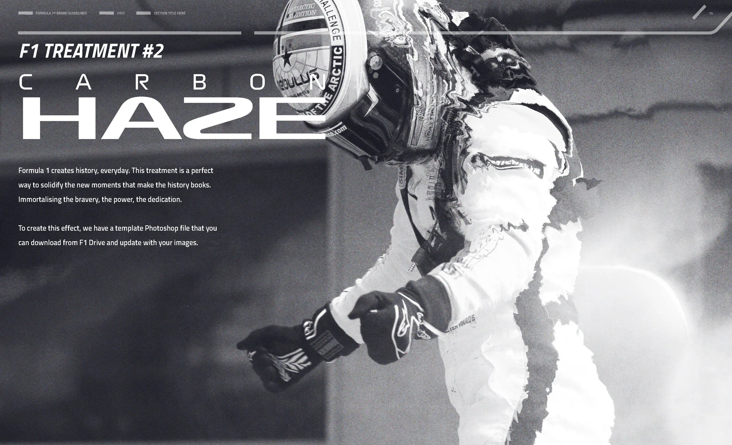
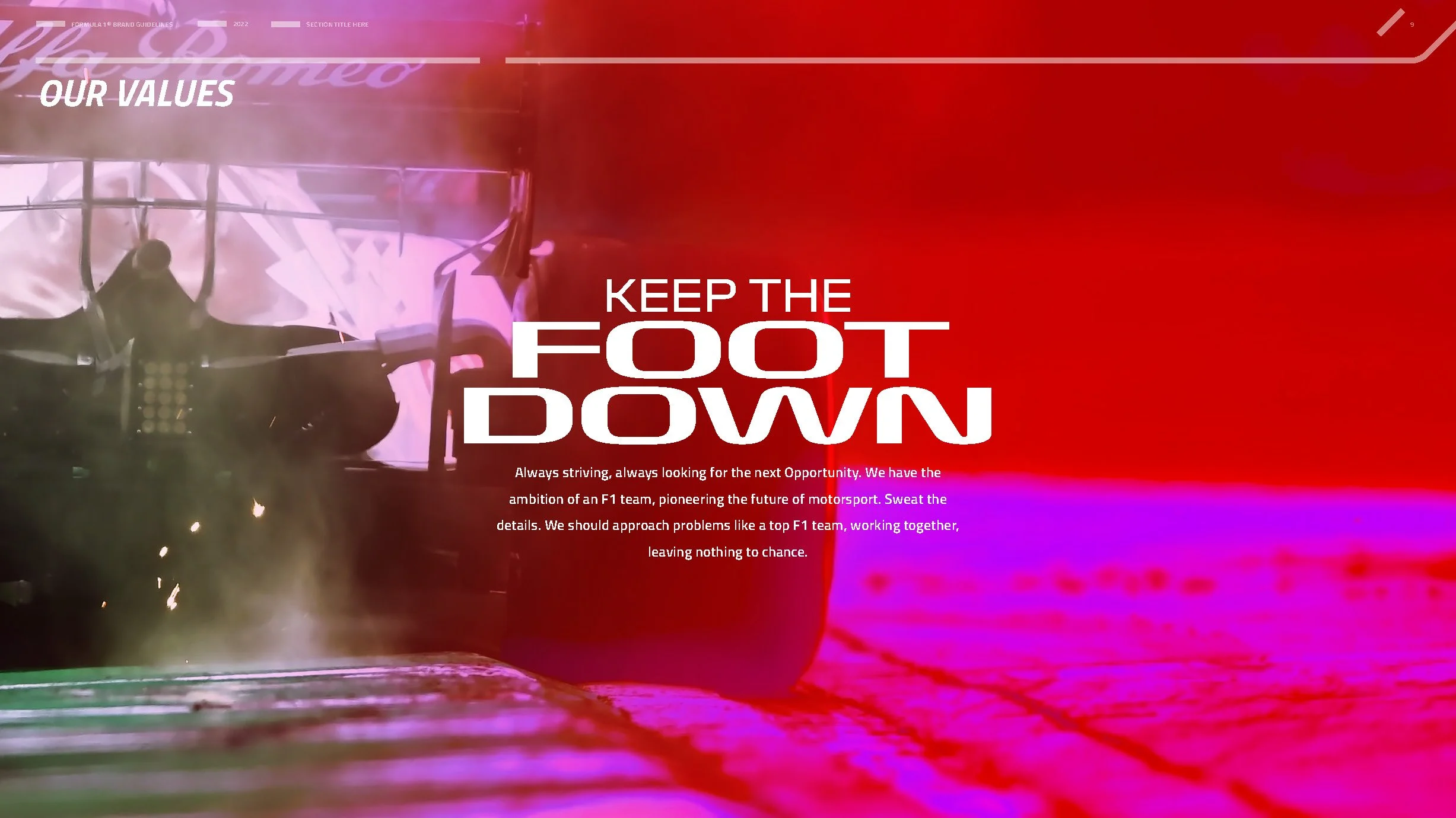
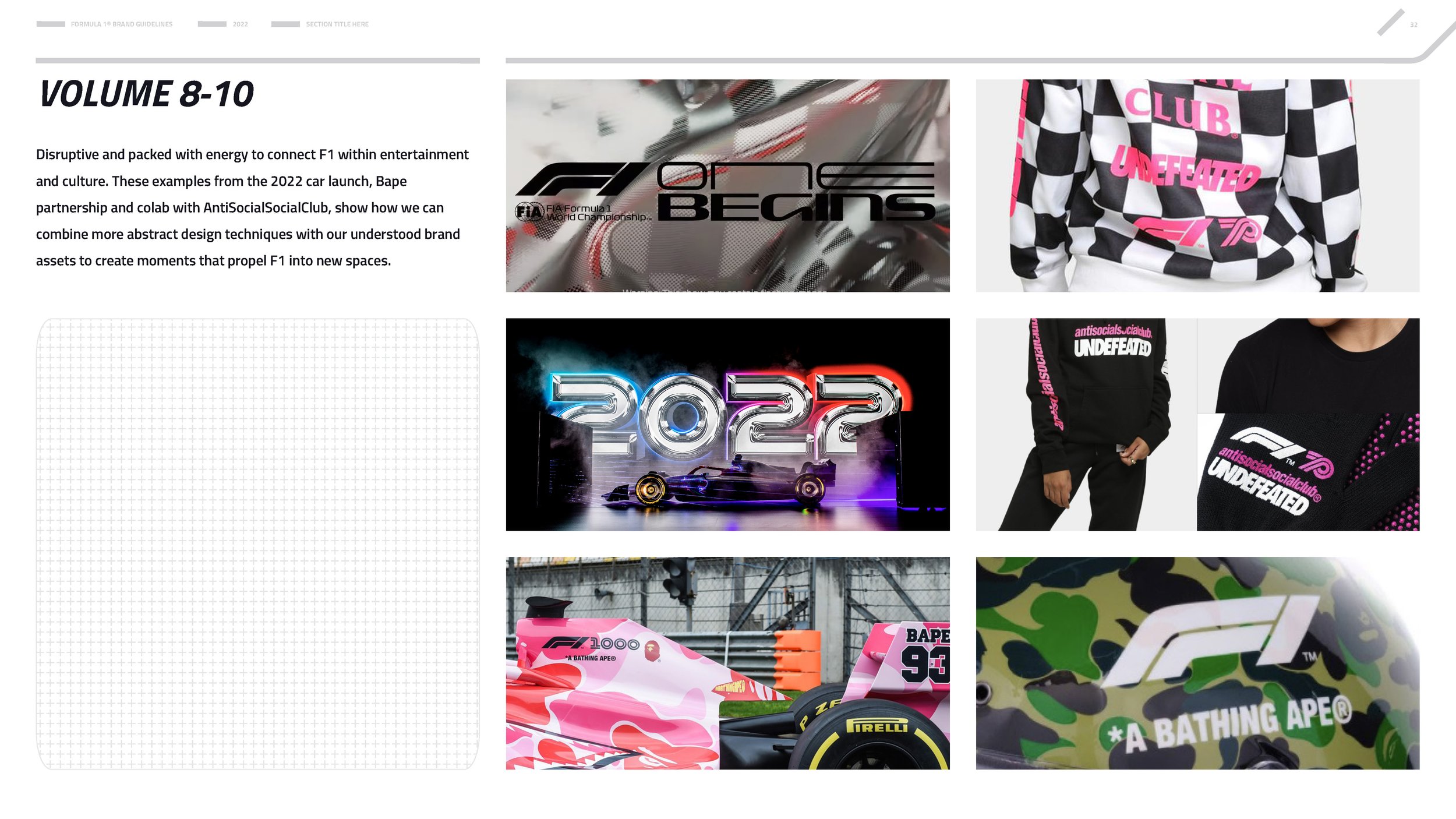
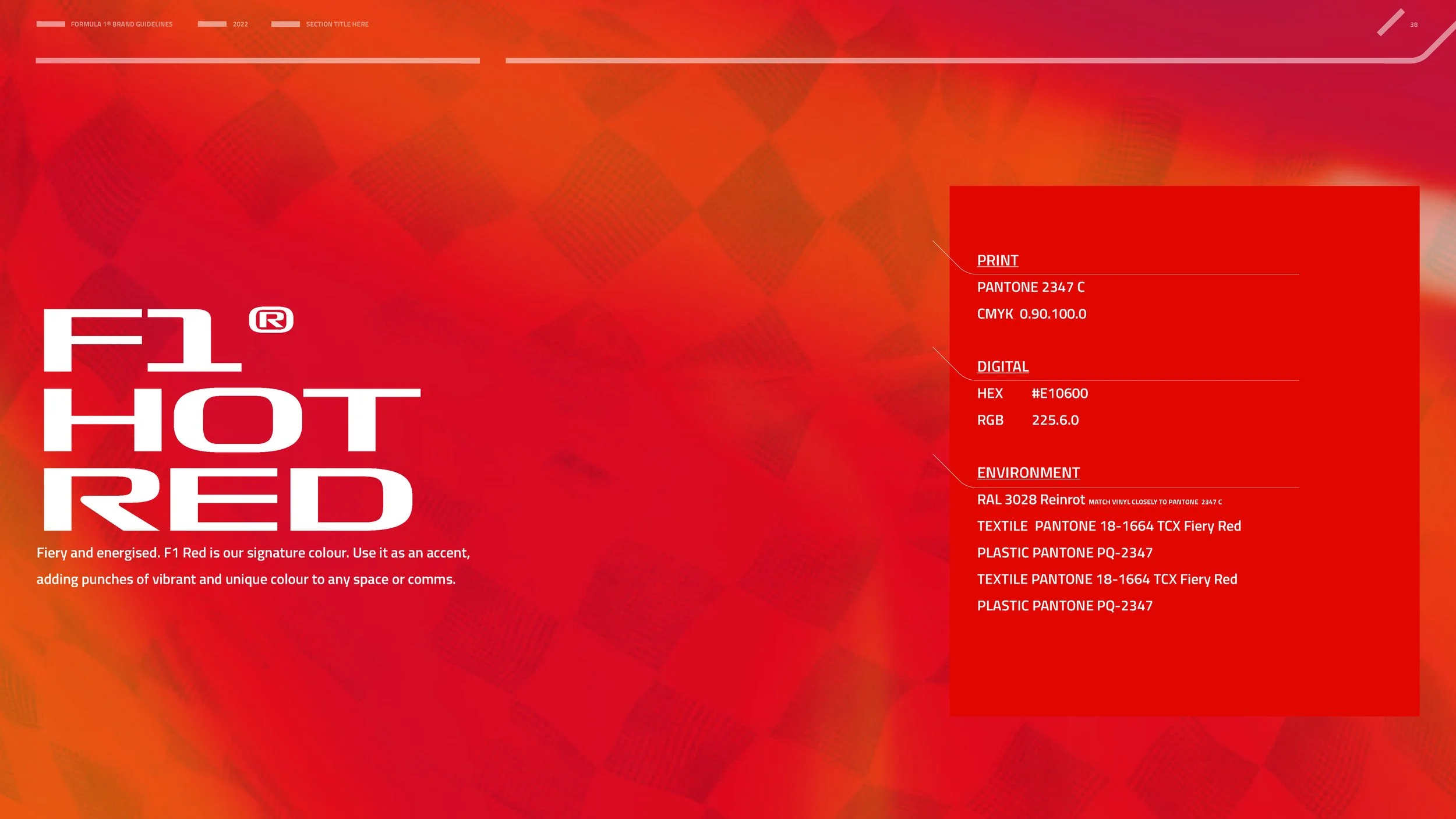
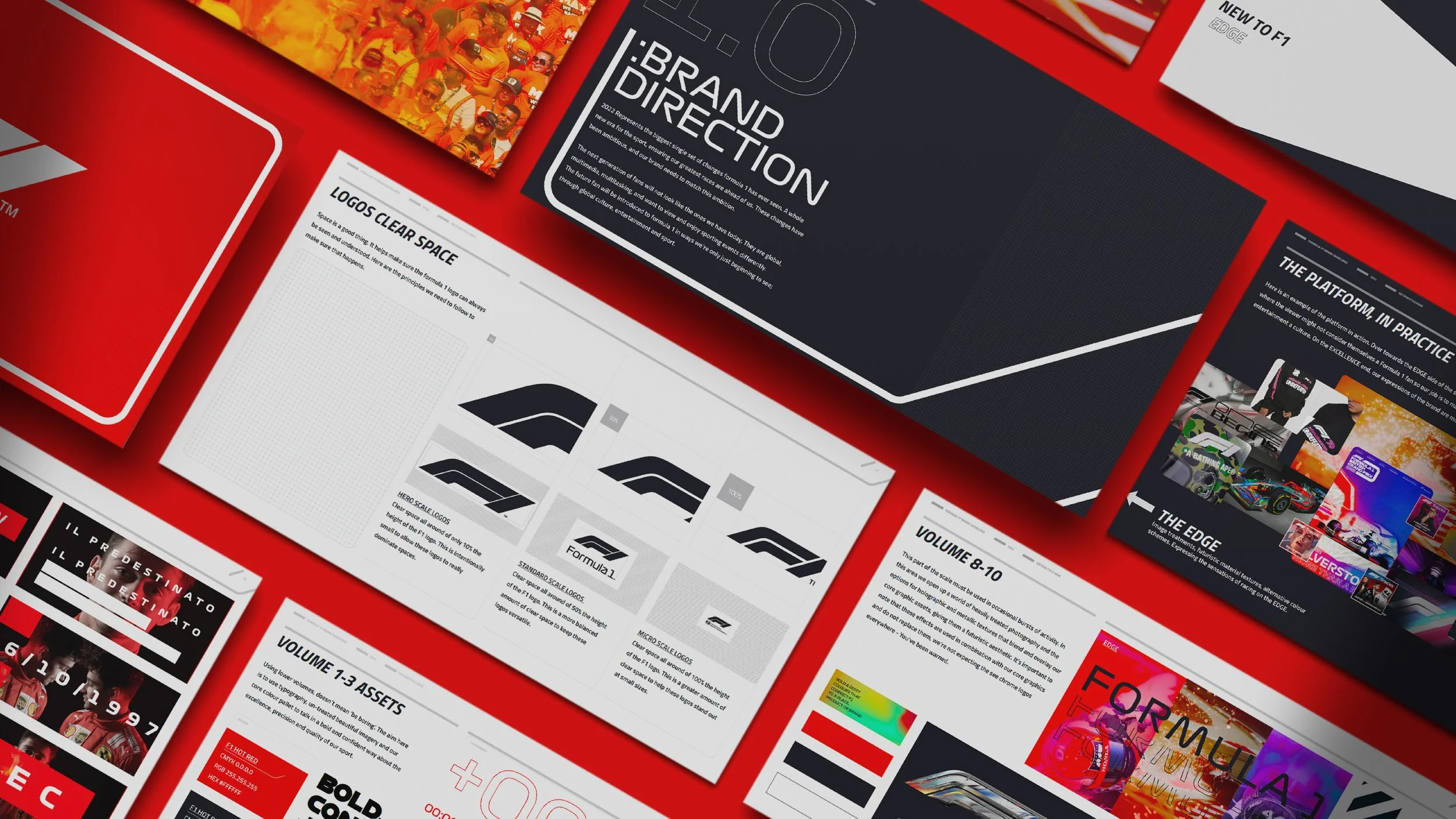
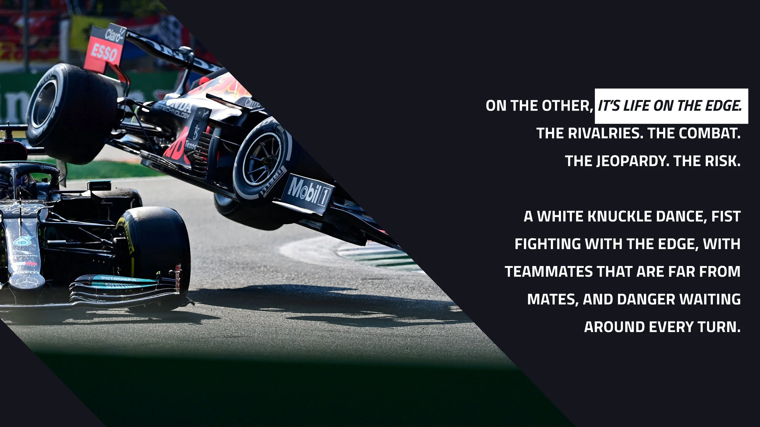
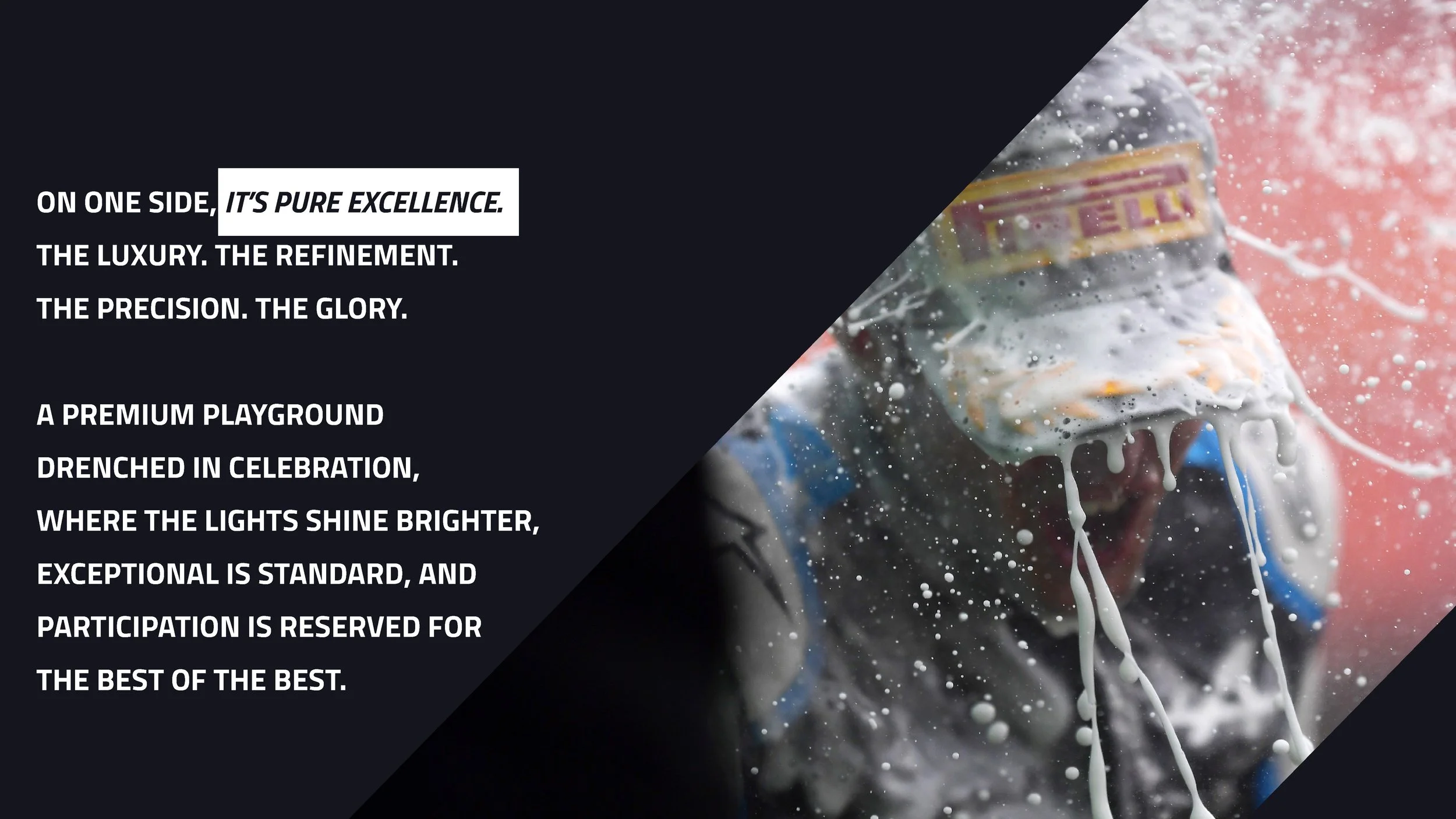
FORMULA 1
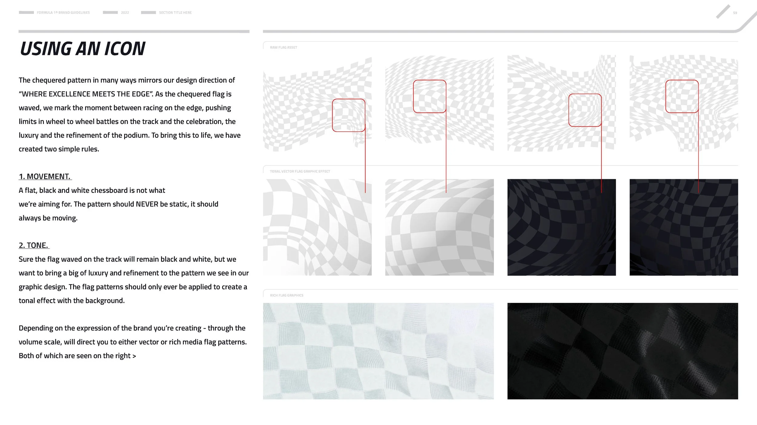
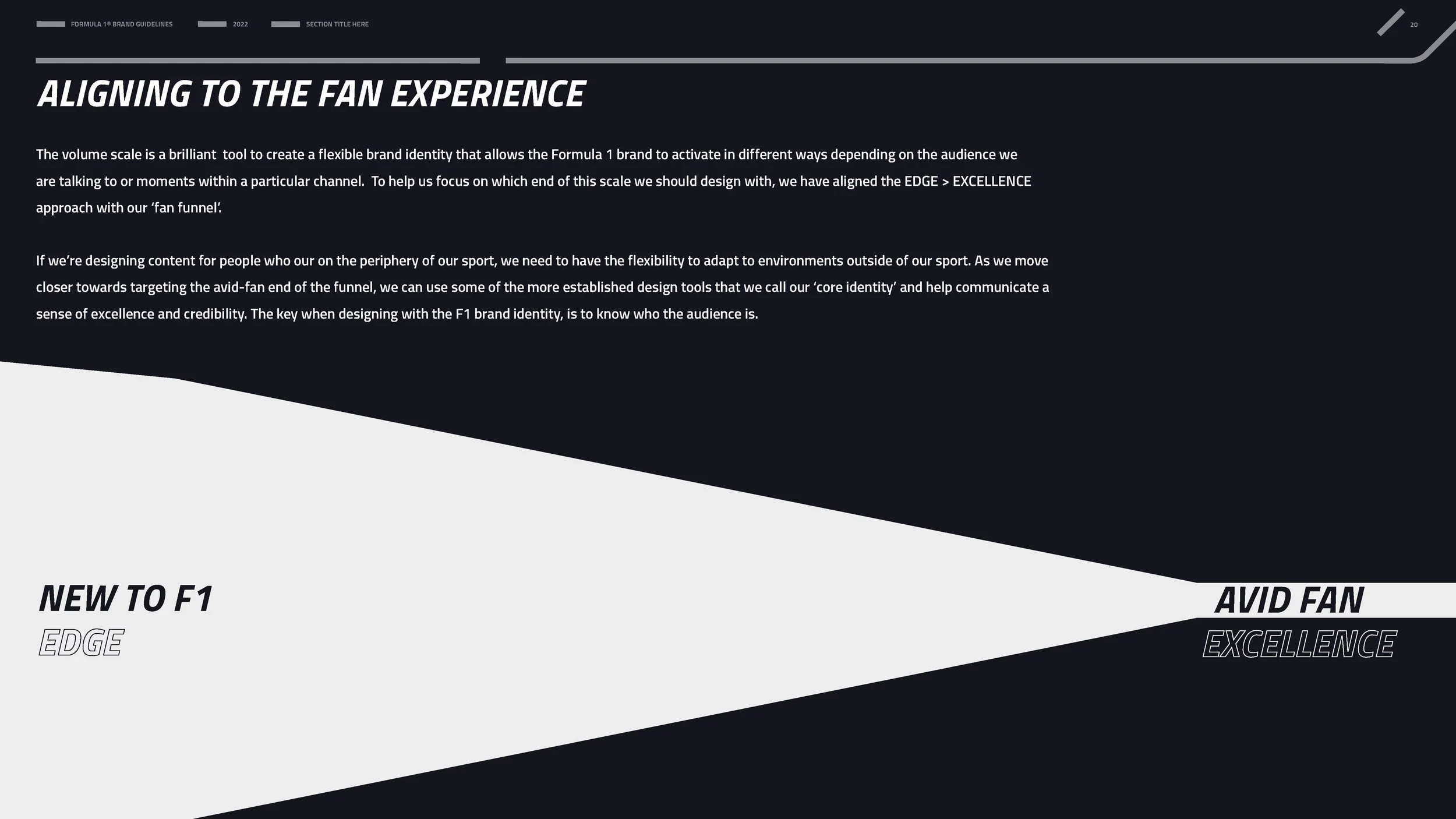
When I worked on F1’s brand, the starting point was strong but overly detailed and not ready for evolving partnerships and consideration of the fan journey. My role was to rethink the guidelines so the brand could flex from podium sponsorships to cultural collabs while still feeling recognisable and bold.
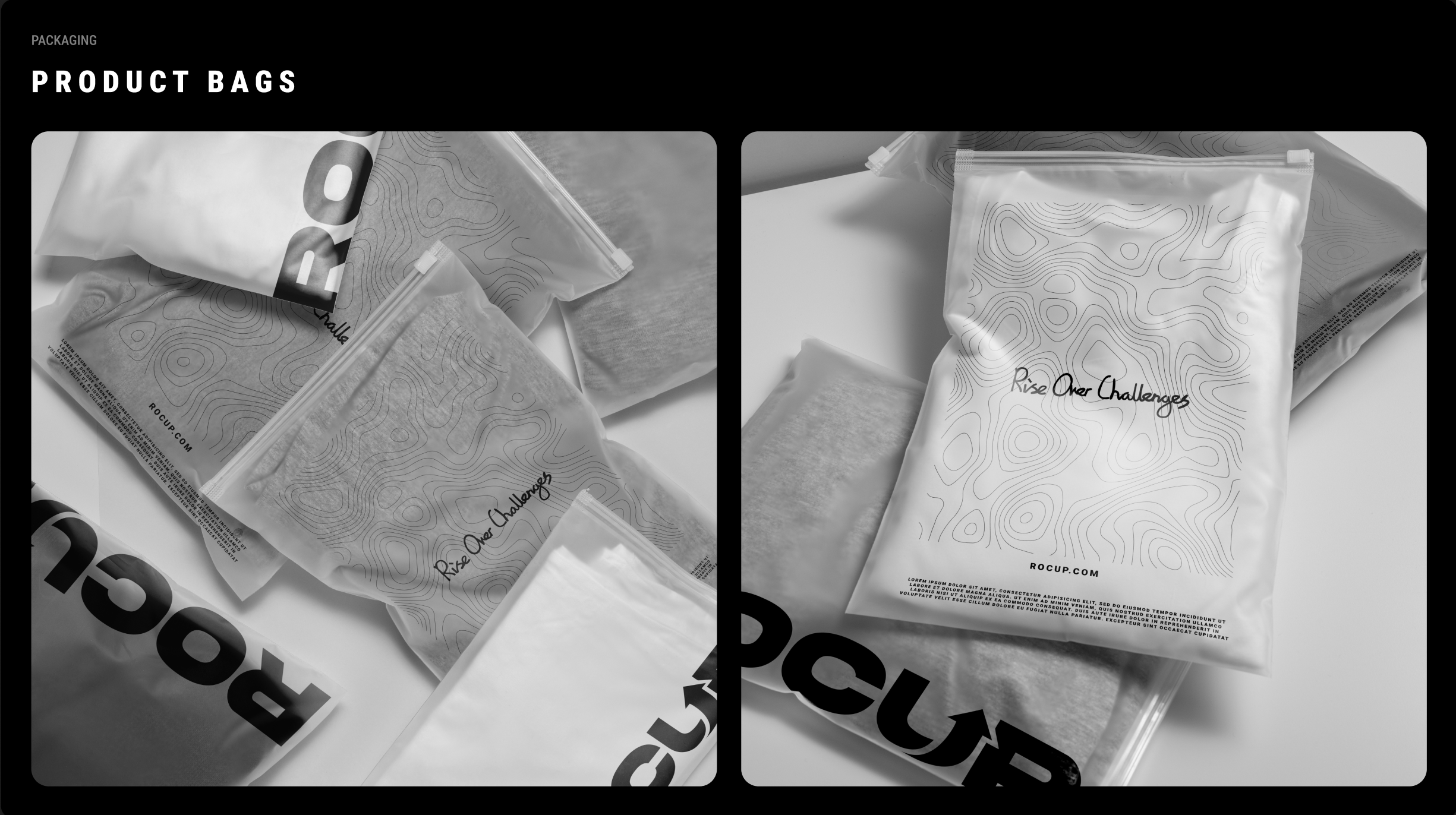
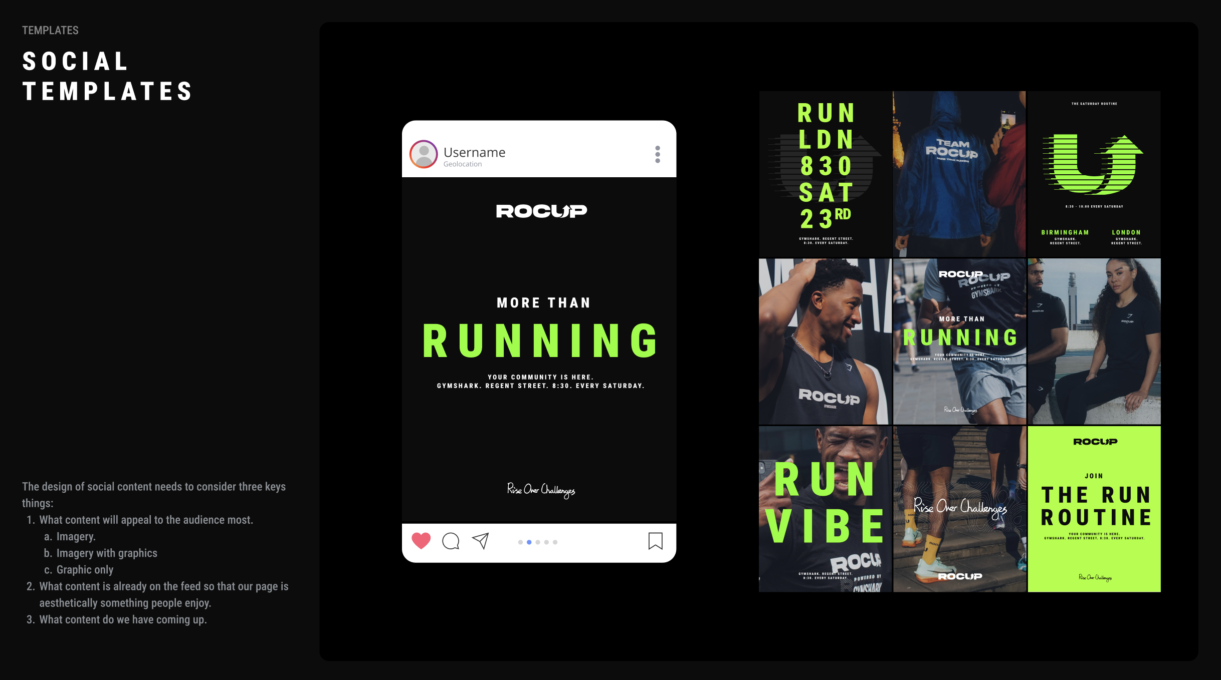
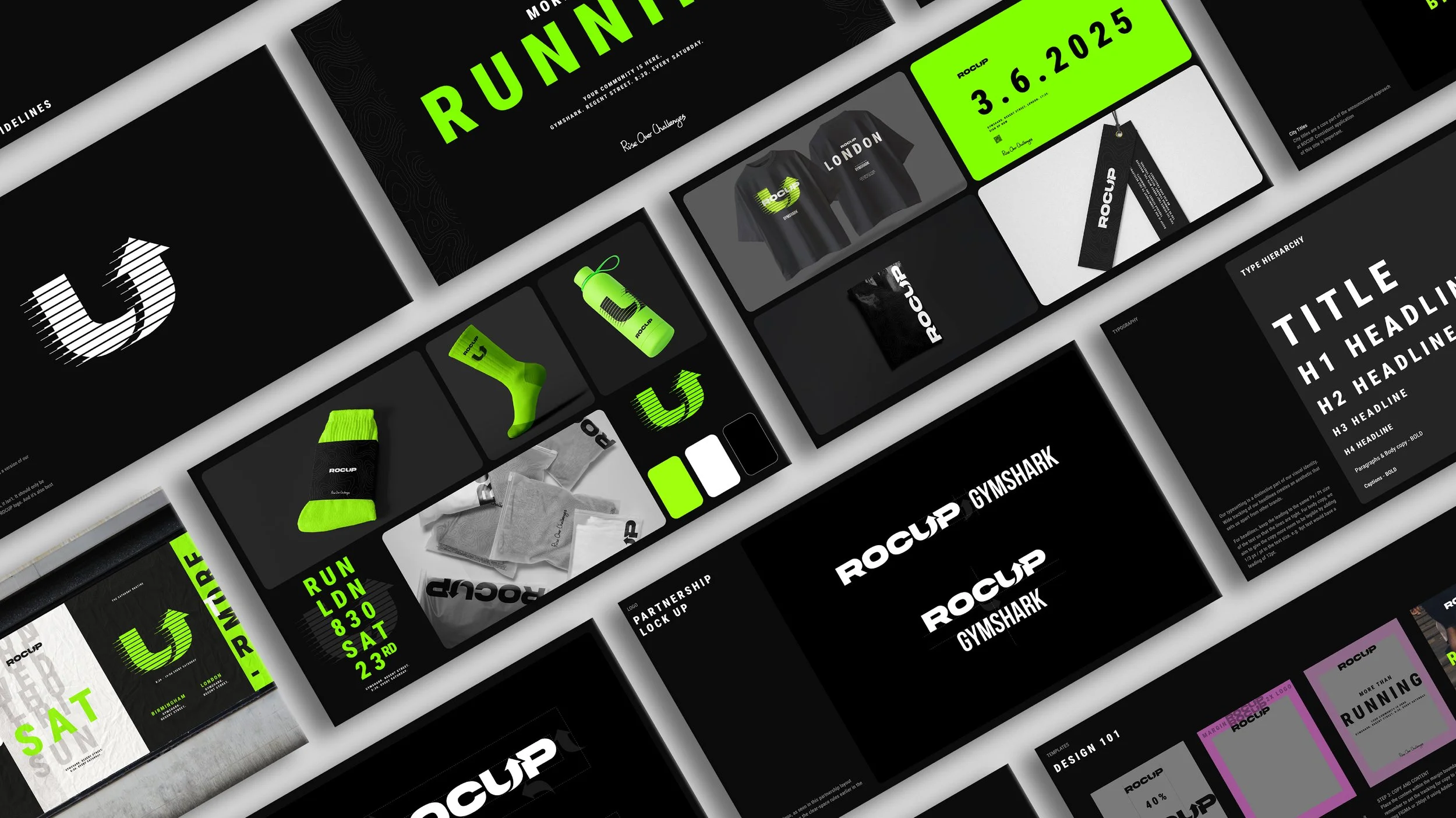
ROCUP
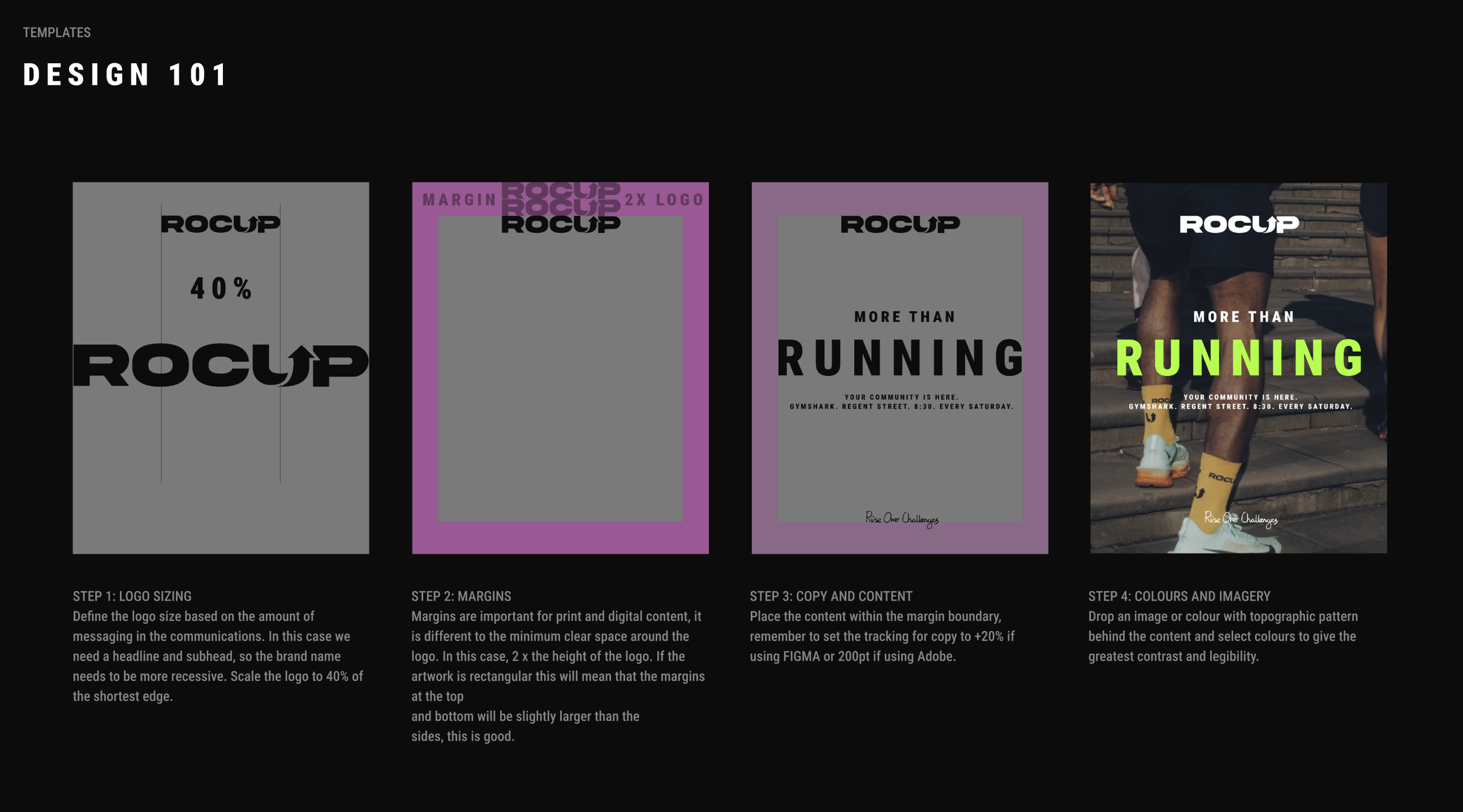
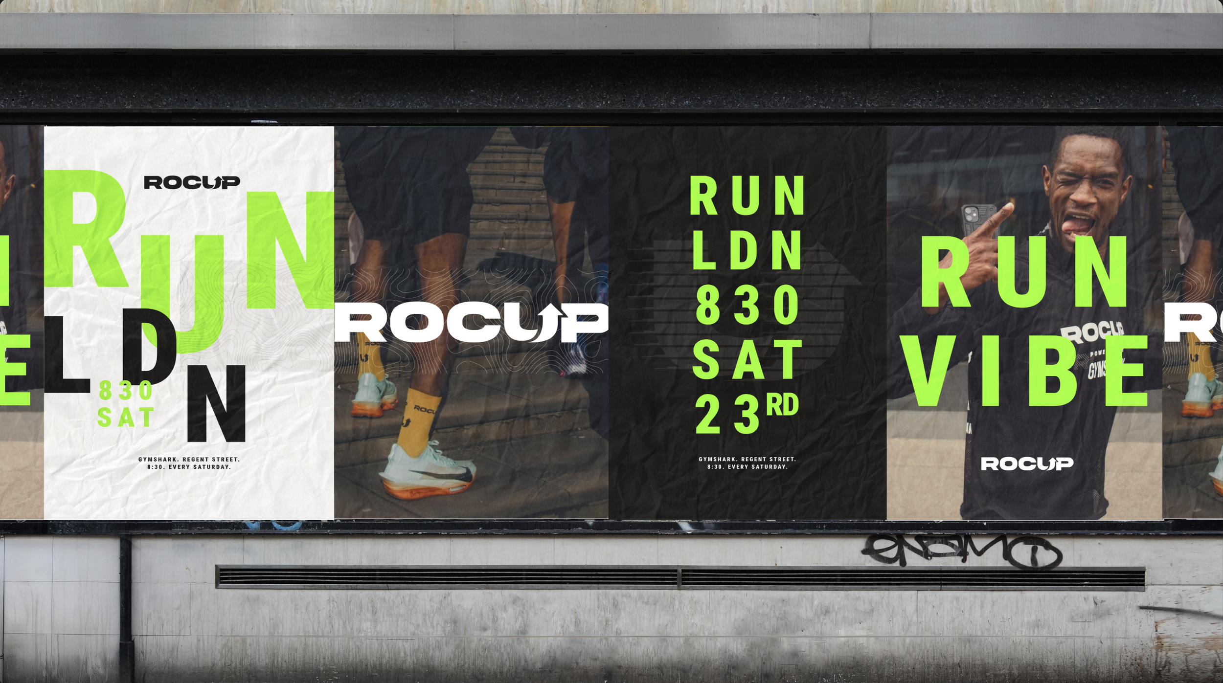
ROCUP is a community-led run club built with Gymshark. Here the design language is rooted in the idea of the journey - from first run to long-term growth. The typography and patterns reflect that narrative physically and visually, bringing energy and connection to communications across channels.
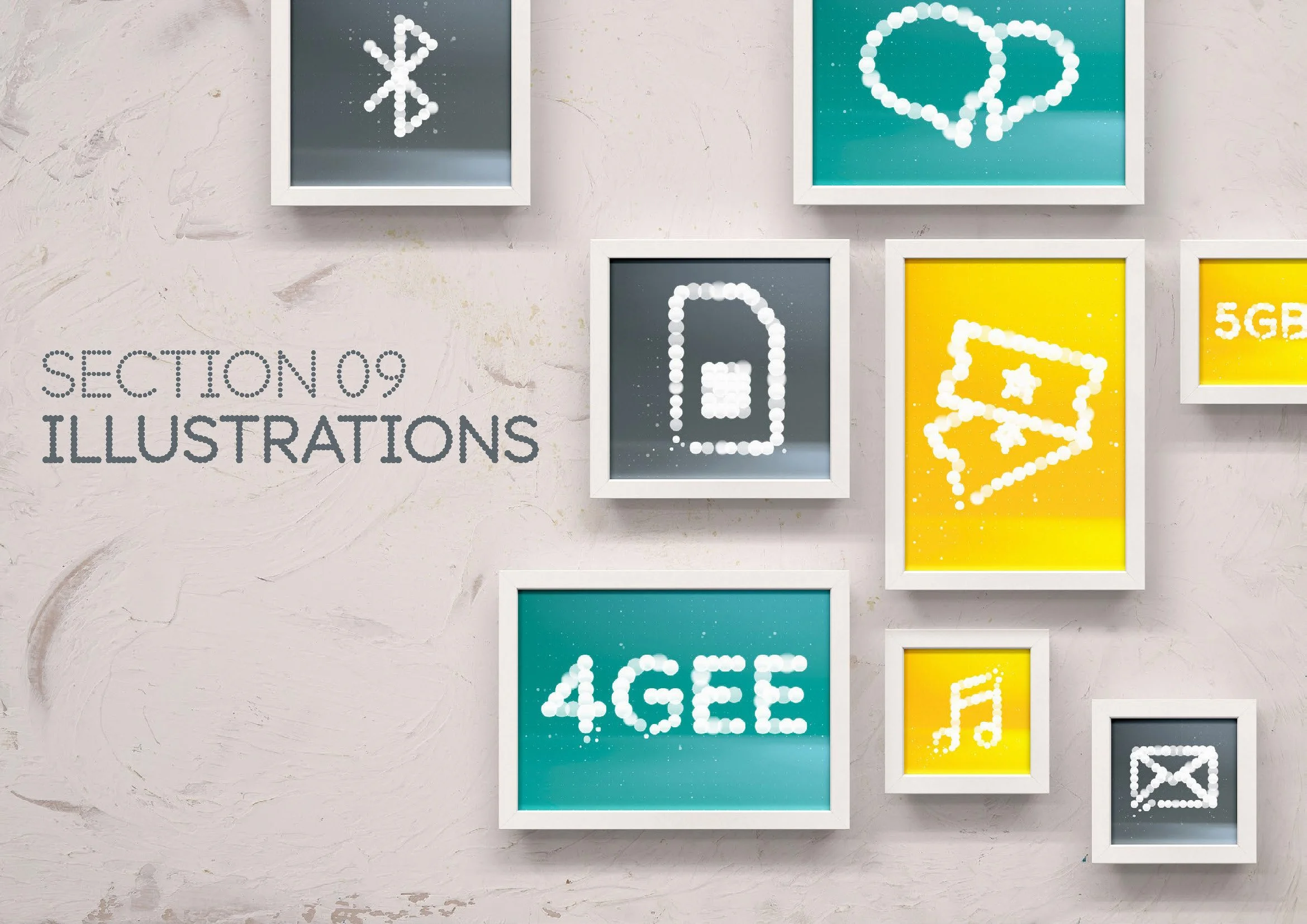
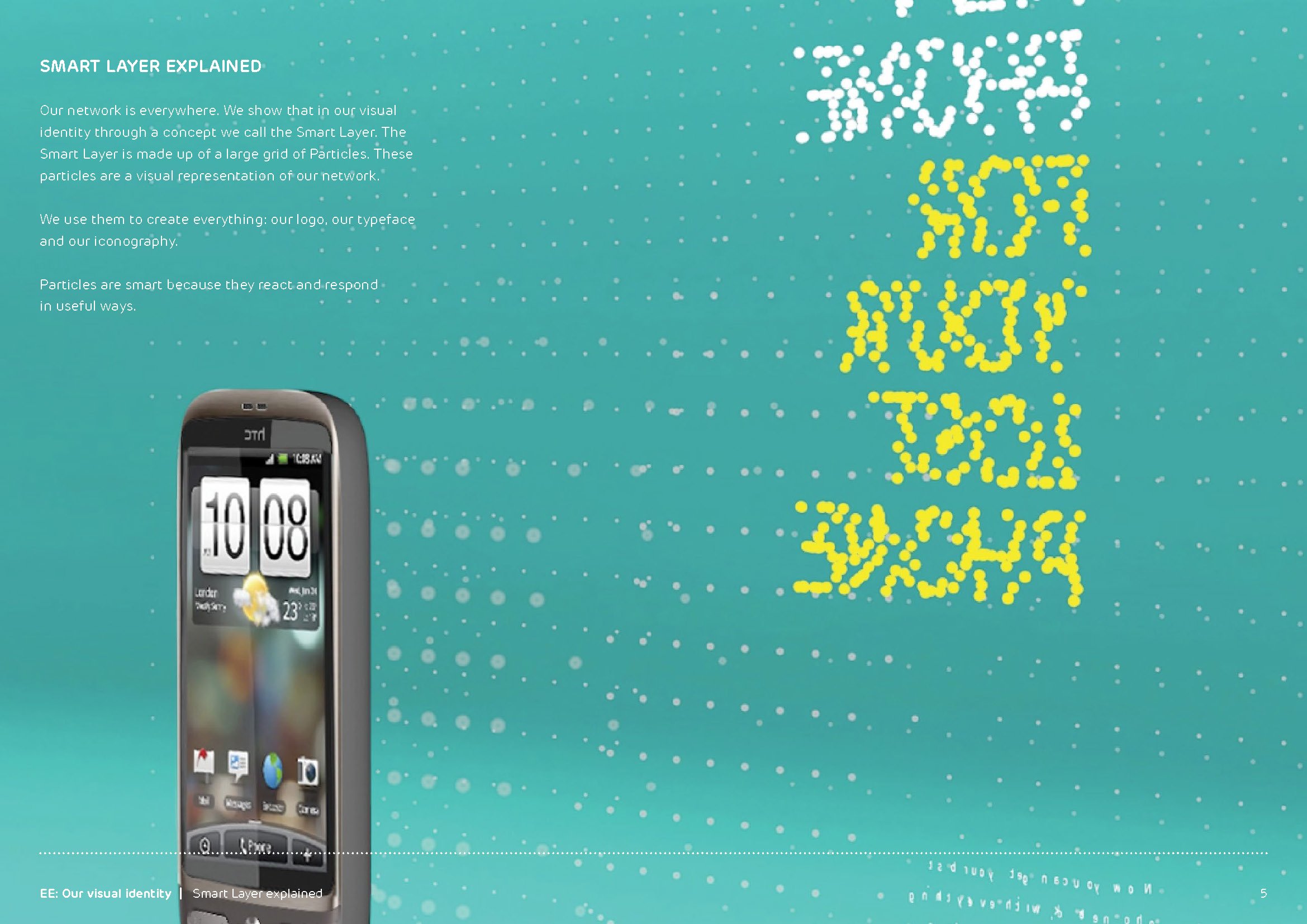
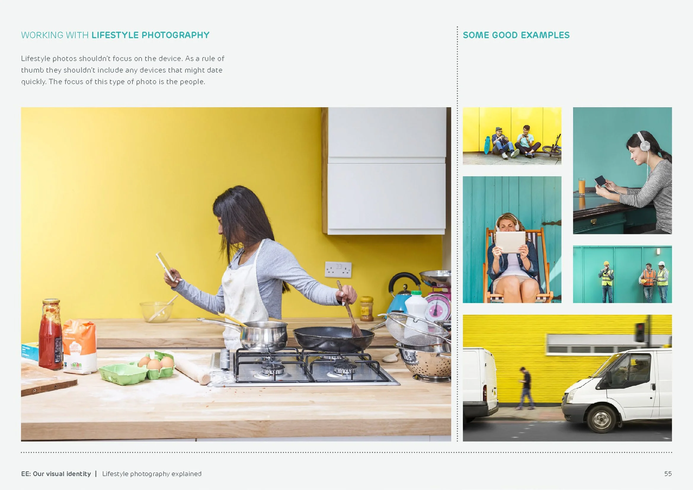
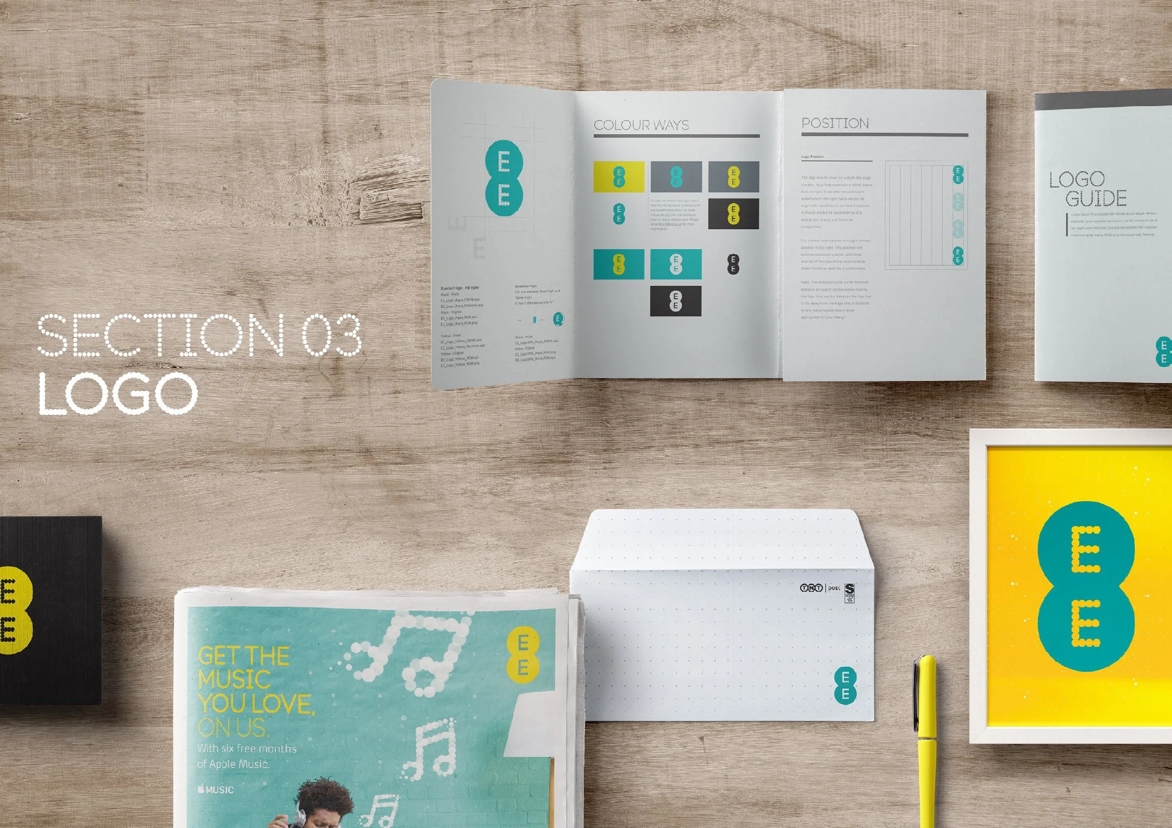
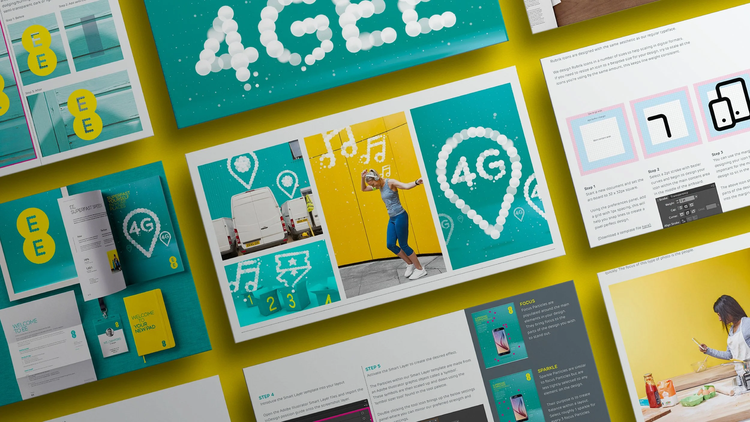
EE
EE’s identity needed a system that could handle everything - from simple print to animated graphics and 3D retail spaces. We took the idea of “dots as invisible connection points” and translated that into a visual system that brings the brand to life everywhere it appears